Artists make a thousand little decisions every moment they are creating.
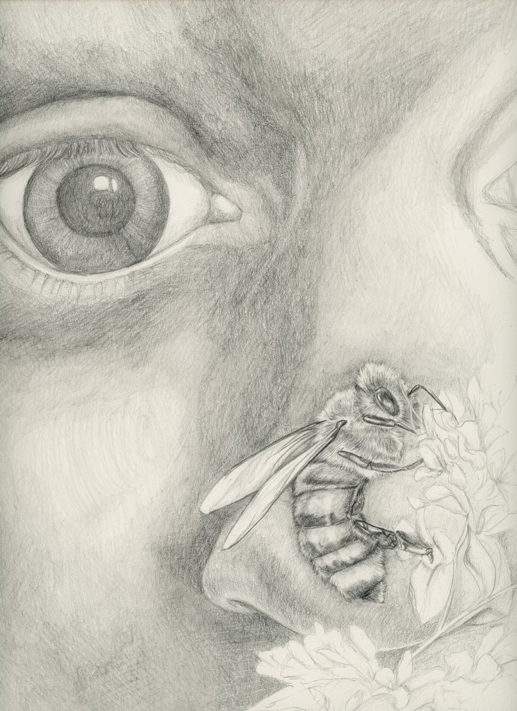
My first draft of this illustration was too huge. It was, in fact, enormous. My decision to get close up was okay, but the magnification was gratuitous (the paper was 18×24). At the suggestion of a skilled colleague, I pulled back a bit.
My next sketch was closer to the feeling I wanted. The eyes are wide in surprise or perhaps awe. But the mouth was too dark near the bee. The girl almost looks like she’s kissing it instead of observing from a distance. I needed to pull back on the contrast in the girl’s face to bring the bee forward.
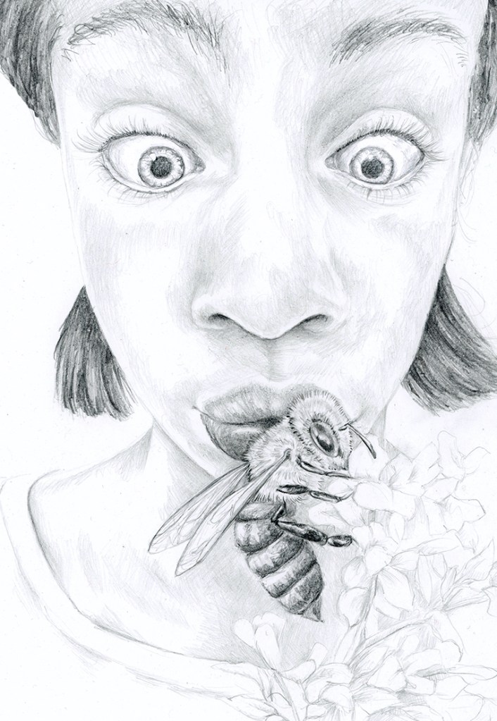
Though my experience is with traditional media, I thought I’d give digital coloration a shot with this pencil drawing. I would be able to pull back the contrast in the girl’s face to make the bee more of the focus. I liked it. A lot.
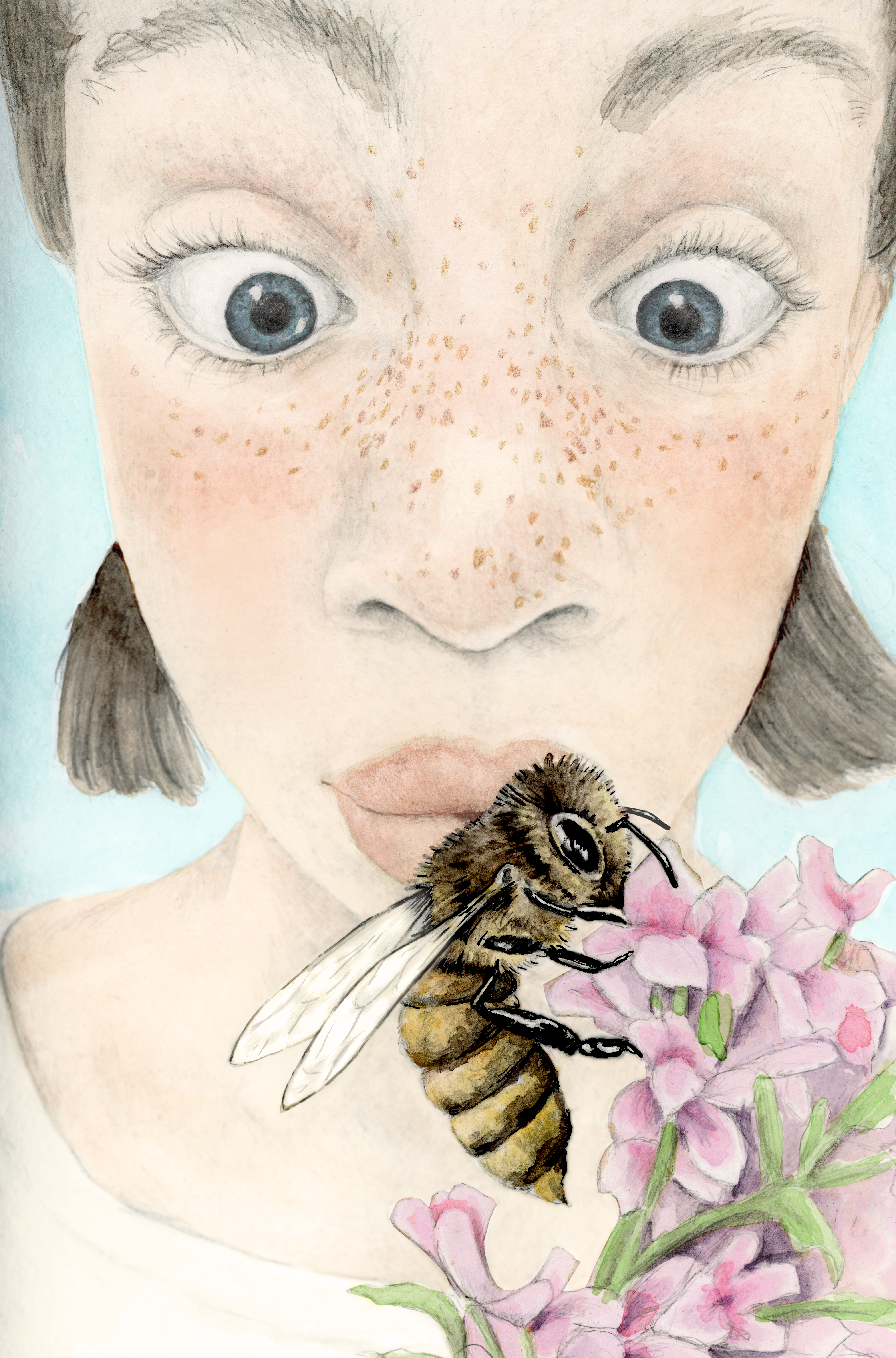
But then I painted the drawing with watercolor and thought the result was much more appealing. Now the digitally colorized image looked flat to me. The girl’s face in the watercolor was more contoured and I absolutely fell in love with the color pencil freckles I added. But there was something about that digital image that still pulled everything together.
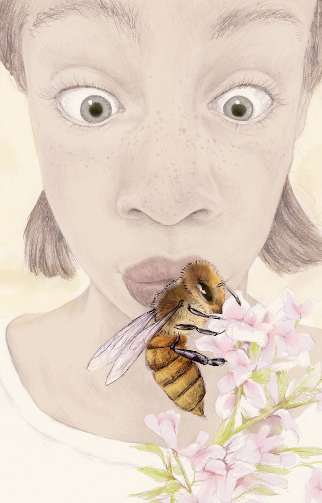
After discussing it with my colleague, we decided that the gold color wash in the digital image was an art decision that made the composition more cohesive. This could be applied to the watercolor as well. I used a photo Filter Layer in Photoshop to give the whole image a unified glow and I increased the contrast in the features of the girl’s face with the Photoshop Burn Tool. Now she was more the focus of the image but without diminishing the importance of the bee.
The end result made me very happy. I just love that freckly little face.

I, too, love that freckly face.